Leviathan is a visually enriched design with stunning graphics, contrasts and tones. Its sidebar adds focus and boldness, that complements the mainbody to great effect. Each preset has a unique color theme for the showcase area, to add rich individualization.
The Sidebar is a unique visual effect for Leviathan, without sacrificing the flexible, six block per row gantry-grid system. Configure the sidebar to multiple grid widths. The sidebar visually supplements the mainbody styling areas, to provide great focus.
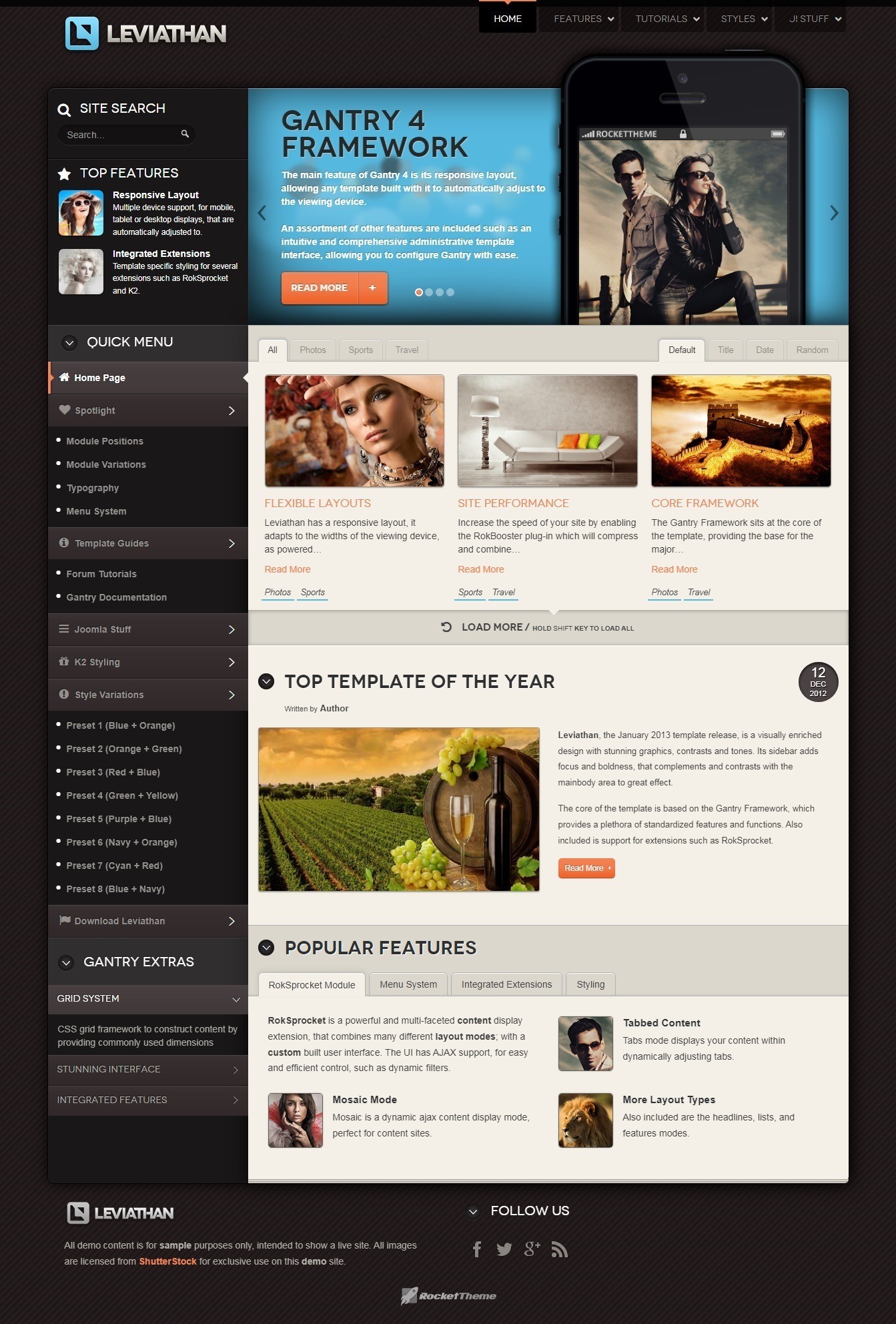
The Featured Content component benefits from a custom override in Leviathan, which typically appears on the frontpage. The override has custom formatting for the date so it appears in a cornered manner with a compact date format, to create a unique content experience.
The side menu, when the fp-menu module suffix is applied, benefits from a selection of FontAwesome icons being applied to the parent menu items. The icons are custom configured in the CSS/LESS, and generate automatically for different items in sequential order.
The core of the template is based on the Gantry Framework, which provides a plethora of standardized features and functions. Also included is support for extensions such as RokSprocket.
NOTICE: Leviathan is a Joomla 3.x Template.
Requirements
- Apache 2.2+ or Microsoft IIS 7;
- PHP 5.3.10+ (PHP 5.5+ Recommended);
- MySQL 5.1+;
- Joomla 3.4.
NOTE: Gantry v4.1.35 is required for Leviathan to work correctly. For more details on the Gantry Framework, please visit its dedicated website.
Key Features
- Joomla 3.x Compatible;
- Responsive Layout;
- 8 Preset Styles;
- 76 Module Positions;
- 11 Styled & Numerous Structural Module Suffixes;
- RokSprocket Responsive Layout Integrated;
- RokAjaxSearch Styling;
- Styled Support for Responsive K2 Layout;
- Powerful Gantry 4 Framework;
- Custom Content Typography;
- DropDown Menu & Splitmenu;
- FF, Safari, Chrome, Opera, IE8+ Compatible;
- HTML5, CSS3, LESS CSS.
Responsive Layout. Leviathan's responsive grid system is designed for desktop, tablet and smartphone systems, each with minor modifications to ensure compatibility in each mode. We use the responsive layout based on Twitter's Bootstrap Framework, with its collection of utility classes, to provide a great degree of flexibility for a responsive design. The table below shows the breakdown of screen resolutions and associated devices, and which layout characters are then applied to each. Responsive Layout for RokSprocket. Leviathan comes with the RokSprocket extension that are built to work with a responsive layout and support mobile touch events, such as 'swipe'.
Advanced Dropdown Menu. For mobile devices, a basic version of the Dropdown Menu will be used. It is activated by a custom menu icon in the top left of the screen. It will either be a tree view or select box menu, as configurable. All other sizes will use the menu's full version.
K2 (Third Party) Responsive Layout. K2 is the popular powerful content extension for Joomla! with CCK-like features. Leviathan also comes with the K2 extension that is built to work with the responsive layout.
DEMO: demo.rockettheme.com/live/joomla/leviathan
DOWNLOAD
Warning
")
")
")
")
")
")
")
")